Fostering Sustainability and Inclusivity in a Mothercare brand.
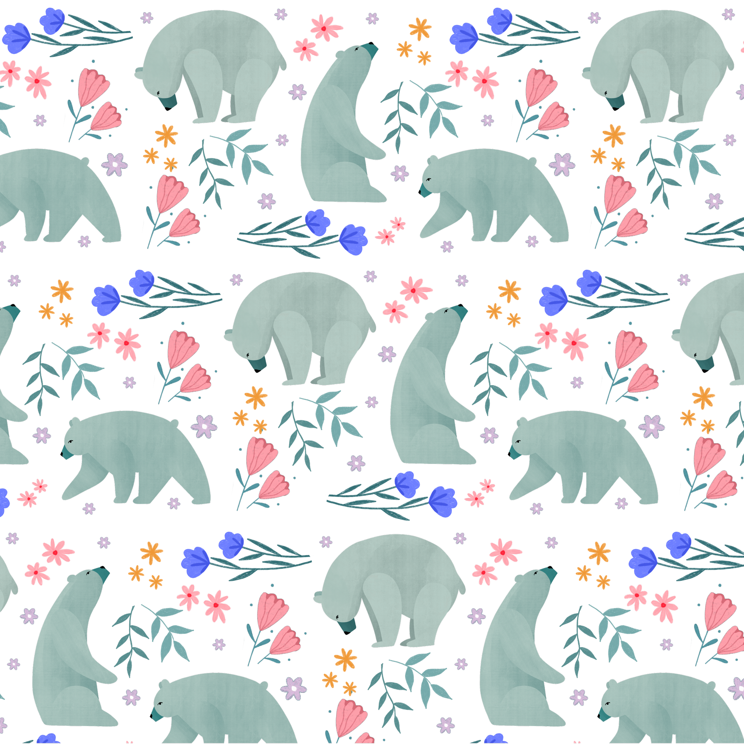
Soley & the Bear was born from artist Bea Müller’s love of her daughter Soley. This sparked the inspiration to create an inclusive brand that draws on natural themes to portray the bond between caregiver and child. The Bear represents protection, a strong embrace and the power in every parent or guardian.
The themes of self-care and connection are present, especially in a post-natal setting where the sense of self becomes broadened. Female empowerment is also at the heart of the brand, to give all mamma bears the confidence to thrive and grow as individuals and as parents.
Through beautiful illustrations of nature Bea encourages those making the journey towards a more sustainable and balanced existence. Now, more than ever people turn to the support of nature to rebalance, restore and reconnect. Soley & the Bear draws upon this connection to create an open and inclusive space empowering women from all backgrounds to thrive and create positive change.


Capturing the heart of the brand…
We have two variations of our primary logo. One as a type based design, and the other incorporating the illustrative icon either to the side or stacked.
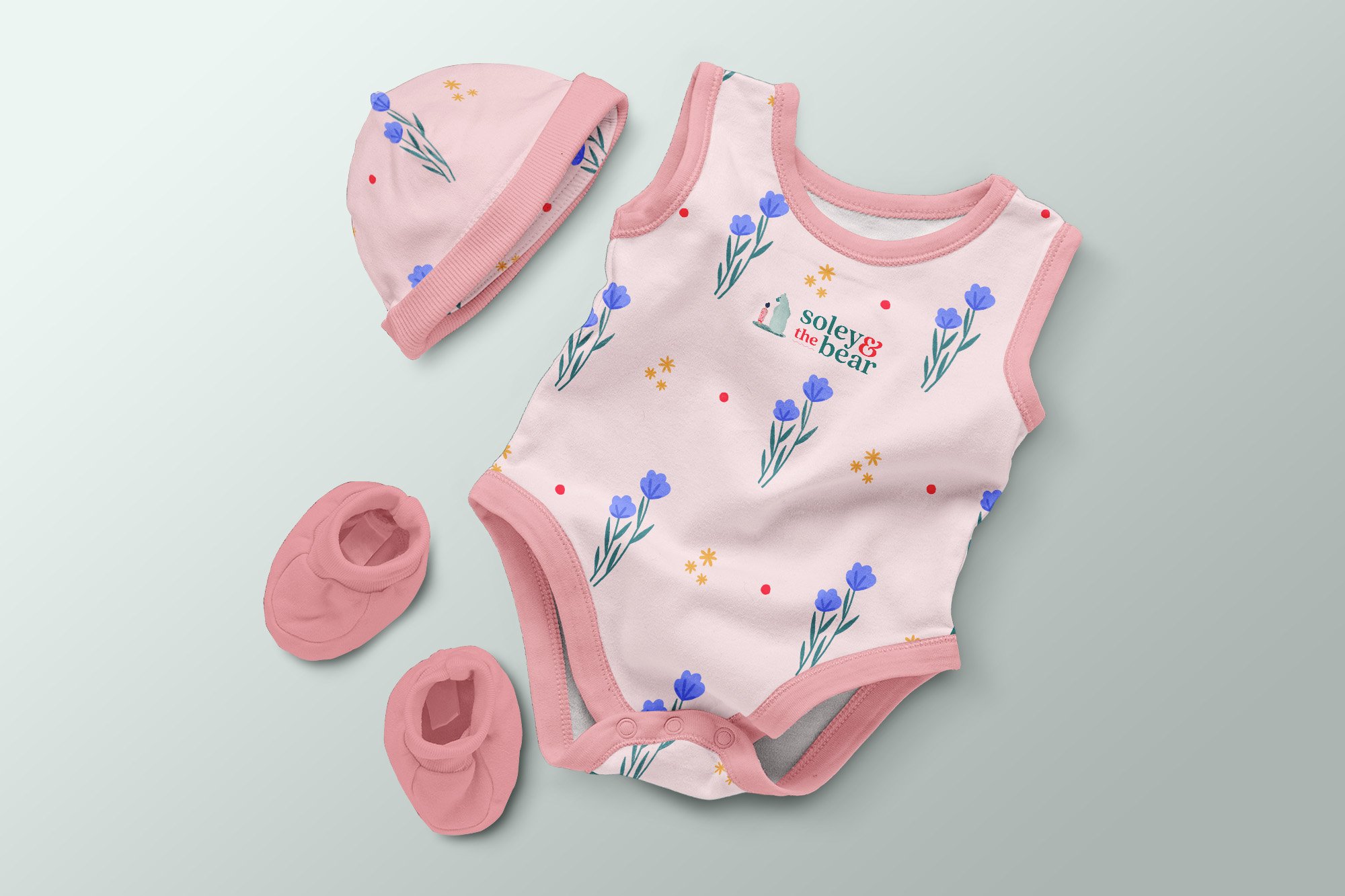
The type based logo lock-up visually mirrors the connection of parent and child. This will clearly communicate the brand to new audiences, but easily across digital and print touch-points as well as on licenses in apparel and homewares. This logo can then be used with or without the illustrative icon logo.


